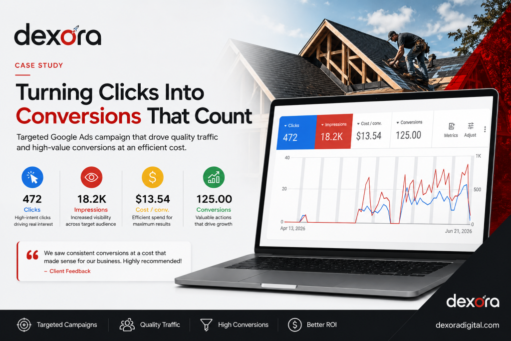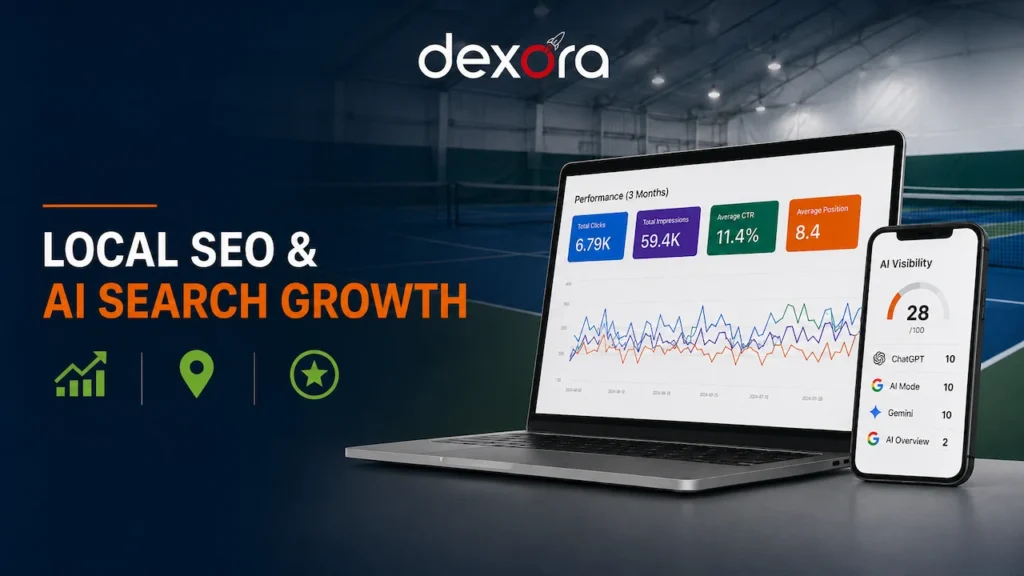
Google Ads says one thing, Meta another, GA4 a third, and your CRM tells a different story again. Monday mornings go into exporting spreadsheets, and the question that matters, which channel brings paying customers, still has no clear answer.
A well-built dashboard brings every source together, reconciles the numbers with your real sales and shows the few KPIs that drive decisions. You open it, you know where you stand, and you know where to put next month's budget.

A dashboard is only useful if it answers a decision. Ours start with the decision, not the chart.
How we design dashboards
Which KPIs to show, which tool to use and why most dashboards are ignored.
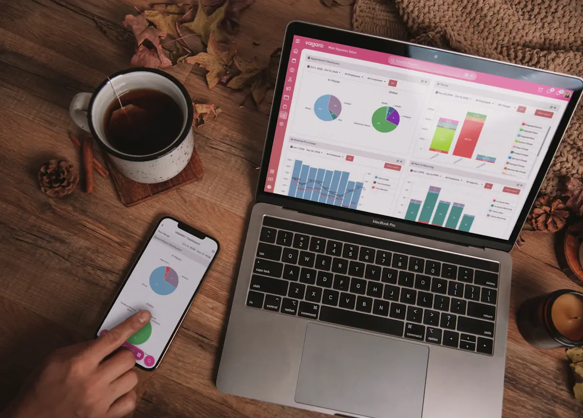
A sales dashboard is a live, visual report that brings your key sales and marketing numbers into one place: how many leads came in, from where, what they cost, how many became customers and how much revenue they produced. It replaces manual spreadsheets with data that refreshes automatically.
The best dashboards are short. They answer a handful of questions clearly rather than showing every metric available.
| KPI | Why it matters |
|---|---|
| Leads by source | Shows which channels create demand. |
| Cost per lead | Compares channel efficiency on equal terms. |
| Speed to lead | Slow replies quietly kill conversion rates. |
| Lead-to-customer rate | Separates good leads from cheap ones. |
| Cost per customer | The number that should guide budget decisions. |
| Revenue and ROAS by channel | Shows what each pound, dollar or euro of spend returns. |
| Pipeline value and forecast | Shows what is coming, not just what happened. |
Many clients use two: a Looker Studio owner dashboard for the big picture and CRM views for the sales team.
Every platform counts differently. Ad platforms claim conversions, analytics records sessions and the CRM records real deals. Without clean conversion tracking and a source recorded on every lead, a dashboard simply shows the confusion more beautifully.
Before we design charts, we fix tracking gaps, agree definitions (what counts as a lead, a qualified lead, a customer) and reconcile the totals with your actual sales. That is what makes the dashboard trusted enough to act on.
From engineering firms and law practices to eCommerce brands and local service companies.










































Trusted by businesses across the United States, United Kingdom, Australia, Canada and Finland.
"Dexora Digital took over our SEO, website development, and digital marketing in early 2025 and delivered outstanding results. The new pages they created are professionally designed, SEO-focused, and highly effective at converting visitors into quality leads. Our content now generates over 8,000 AI citations per month."

"Great experience from start to finish. The quality of the monthly local SEO, GEO, and AEO work is outstanding, and everything is handled with care and expertise. Communication is clear and professional. I genuinely enjoy collaborating with them and appreciate their long-term, results-driven approach. Highly recommended."

"It is a pleasure to work with them. They are very knowledgeable and responsive. They did great job on our website redesign and AI search optimization."

"Working with Taqweem has been a pleasure. He and his team are thoughtful and responsive about how they develop sites. Communication is continuous, and he listens intently. He is comfortable offering suggestions that enhance your ideas without increasing cost."

"I've been working with this team for about a year now. Every time I do a project they are responsive, respectful and deliver high quality work. I would recommend them to anyone needing their services."

"Exceptional service delivery and knowledge. I can highly recommend Dexora Digital SEO services. They developed the website for me and are now managing SEO with exceptional progress."

"Professional, responsive, and highly knowledgeable. Dexora explained everything clearly and delivered exactly what was promised. Because of the experience, we moved forward with ongoing SEO services."

"They did an excellent job with my SEO. He clearly explained what he was doing, why it mattered, and delivered everything on time. The improvements he made were detailed and practical."

"I got a result that far exceeded my expectations, and I want to thank the team very much. They worked meticulously and understood our needs, delivering exactly what we wanted. I definitely recommend them."

"I’m extremely impressed with the SEO work delivered. They were knowledgeable, responsive, and provided clear insights into how to improve our site ranking. They performed a detailed audit, optimized key pages, and gave actionable recommendations that actually made a difference."

"Professional, and he took his time to explain insights clearly."

"Very thorough work with research and implications. Clear and concise formatting."

"Excellent customer service, great work. I will definitely use him again."

"Awesome team."

Every engagement we run is reported against real numbers. Here are some of them.
Tools, data sources, accuracy, cost and maintenance.
 Dexora DigitalTaqweem Ahmad & team · 20 experts
Ask me anything about SEO, Google Maps, getting found in ChatGPT, websites, pricing or our results. I reply in seconds, and Taqweem follows up personally.